Case Study

Ginetta

A highly successful race car manufacturer and events company, with a rich British heritage.

Read on

Project overview

A website to do the business justice

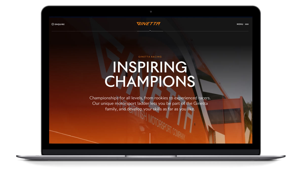
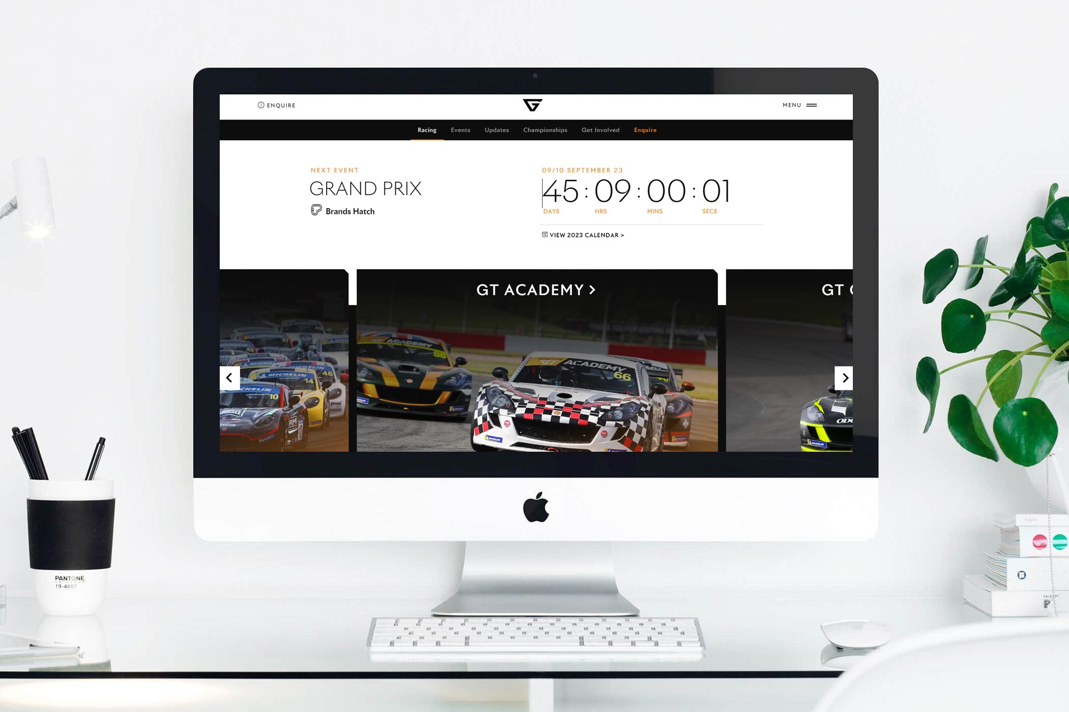
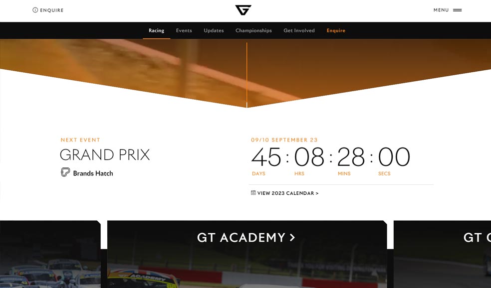
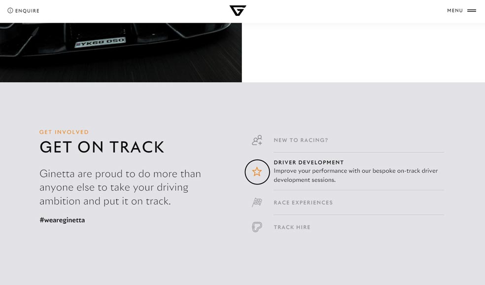
Ginetta is a British sports racing car company founded over 60 years ago, which today delivers excellent motorsport knowledge, state-of-the-art facilities in addition to the finest on-track action.

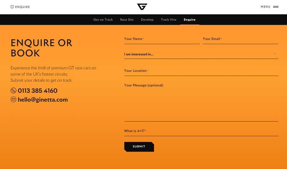
The existing website was out of date, static and uninspiring. A new one was needed that better aligned with Ginetta’s ambitions, by positioning them as a pioneer in their field, showcasing their industry-leading products and promoting their activities on the motorsport calendar.

The challenge

Simplifying a complex web of legacy data

The old website had built of a large amount of redundant data, and over the years it had been bolted on to many times to create quite a confusing structure. Most content had become unmanageable and out of date. There was a significant logistical and technical challenge to understand the existing user-journeys and how best to move forward to create a more coherent narrative that accurately told the story of who Ginetta are and what they do.

People come to the Ginetta site for a variety of reasons – for car details, championships info, shop merchandise and technical downloads. It was important that they could easily get to the key information that is important to them while keeping the core content up-front. The old website tucked a lot of this content away in multiple sub-menus, creating a frustrating experience.

What we did

Impactful design and a streamlined user-experience

We built a striking and media rich website that delivers impact as soon as you land on it through crisp design features and engaging video. The design has a minimalism which lets the content breath and allows the images to communicate.

Each key landing page has been developed with a logical sequence and a user-friendly flow to it. We established a hierarchy of importance for all content, and the user moves down through this until they reach what they are looking for. Eventually, further calls-to-action come in and act as sign-posts in the road if needed.

There is still a wealth of content on the site, but it has been greatly simplified at first glance. The e-commerce area (merch) and password-accessible technical downloads are where they need to be, without being a distraction.

Features

Some of the things we really like

Next up

Circus PPC

Memorable UX design for Circus

Paid advertising specialists who deliver consistently stellar results for an enviable client list.
View case study